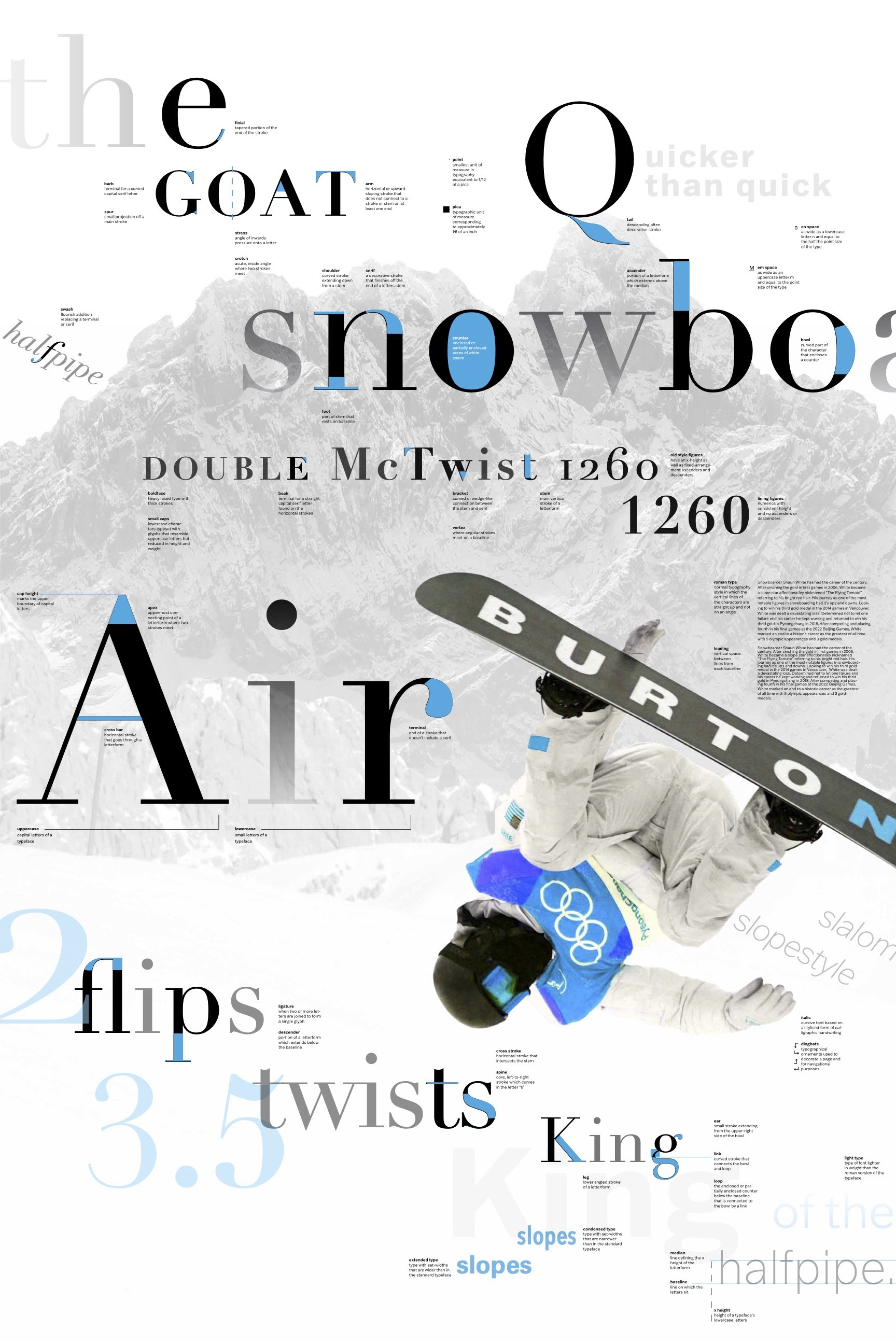
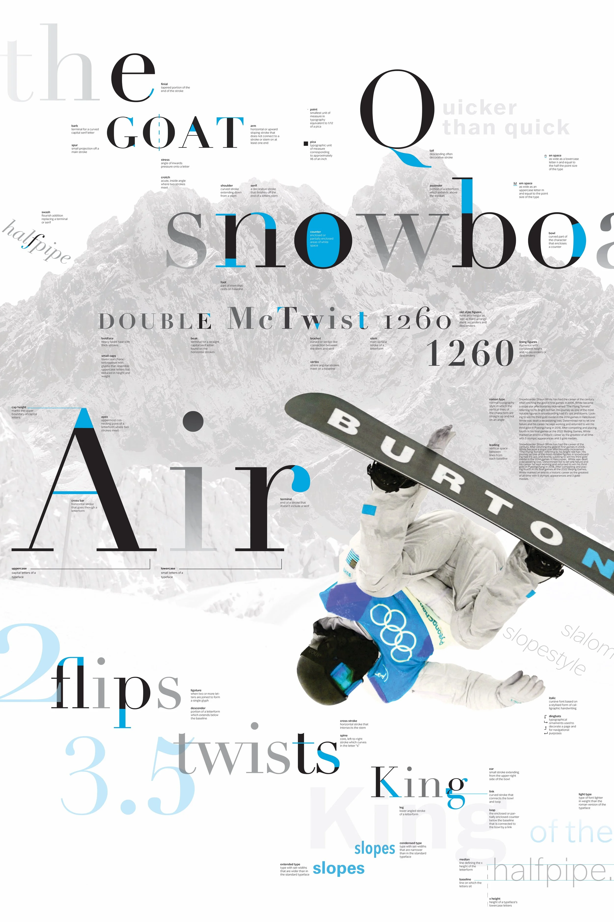
typographical elements poster
spring 2022
-
The first assignment in my Type 2 class was to perfect a visual dialogue between structured and unstructured typographic elements within a frame. The main goal was to create relationships between type as image and type as information/text while enforcing that type as image takes priority in the hierarchy. The concept chosen could provide additional imagery and an opportunity to enhance and unify the information while engaging the viewer. We had to define 21 type terms and identify and showcase 28 letterform parts all while following a strict grid.
-
The route I took with my poster was to make it snowboarding themed. While it may seem a little random for someone who has never been on the slopes, I grew up loving to watch snowboarding greats like Shaun White on the halfpipe in the Olympic Games. The primary focus of the poster is a picture of Shaun White midair on one of his runs in the 2018 Winter Games. I focused on having the type convey an icy yet elevated aesthetic through using the typefaces of Didot and Franklin Gothic.
specs
dimensions : 24 x 36 in
typefaces : Didot, Franklin Gothic, Univers, Avenir

week 1

week 2

week 3

week 4

week 5

week 6

week 7

week 8

week 9

week 10

final

